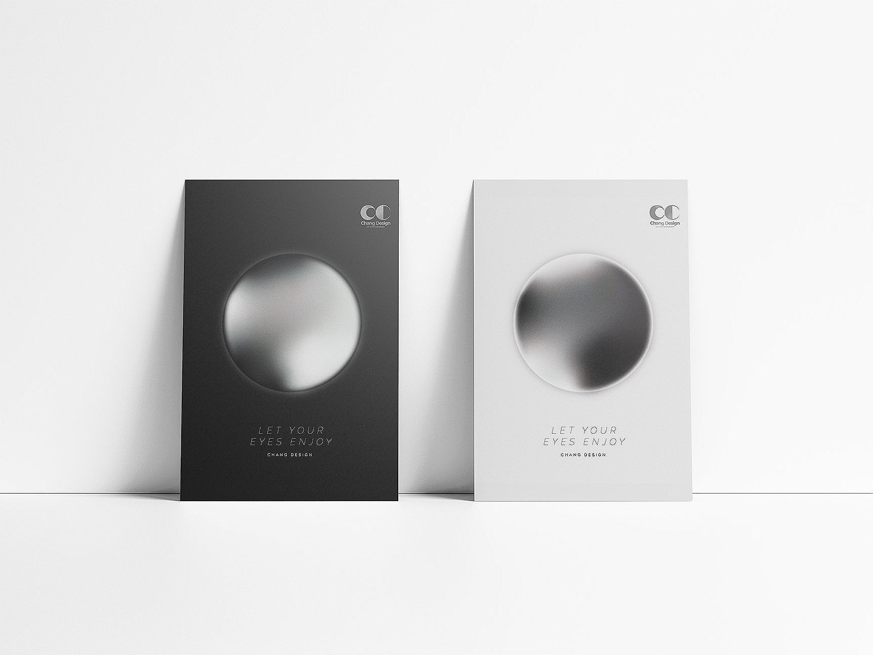
let your eyes enjoy chang design////////
let your eyes enjoy chang design////////
CHANG DESIGN
LEt your eyes enjoy
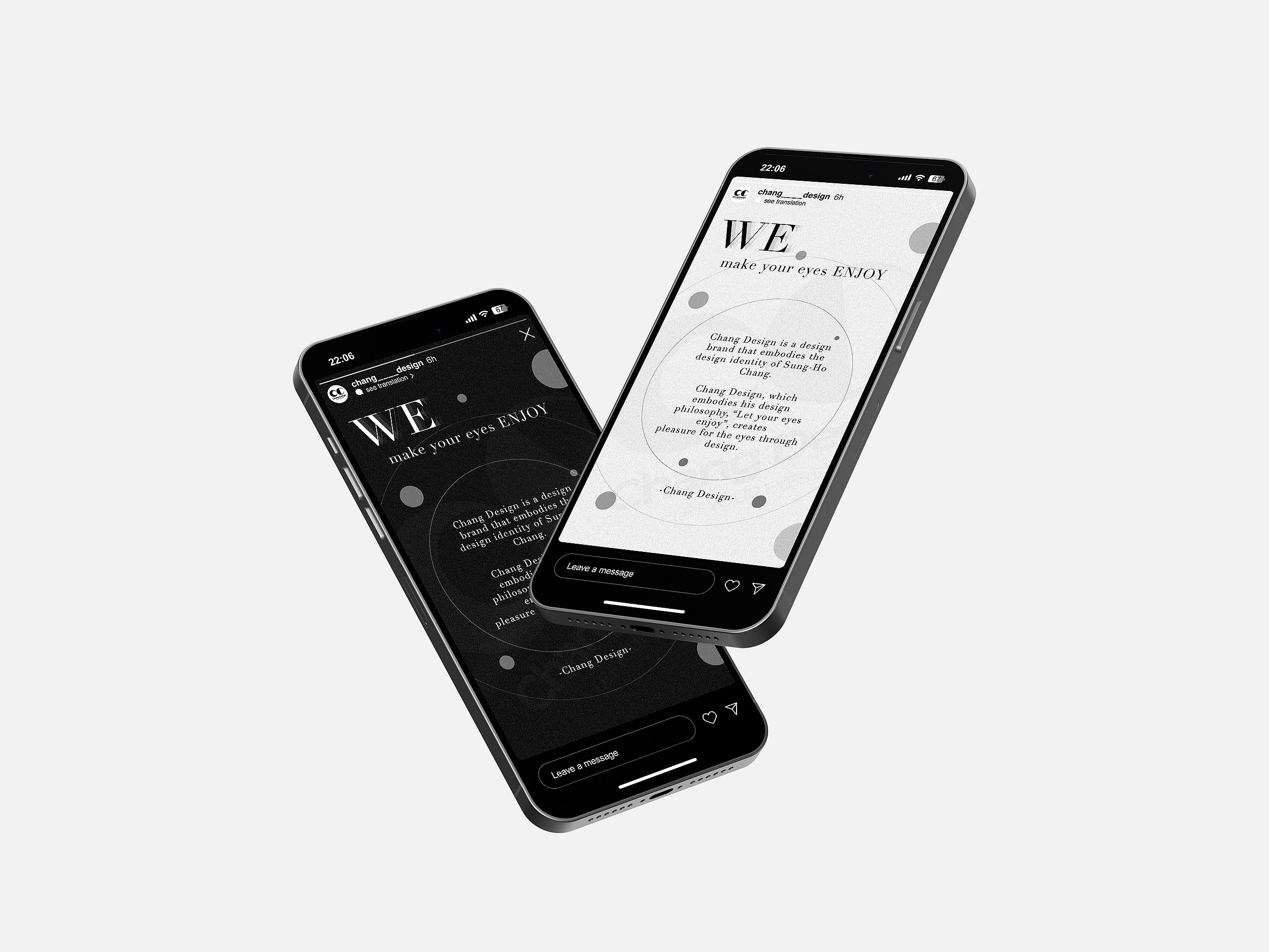
Sung-Ho Chang’s design brand project
Chang Design is a design brand project for the public and for people who are uncomfortable distinguishing colors in our society. With the design philosophy, "Let your eyes enjoy" they design innovative, sustainable designs so that not only the general public but also colorblinds can enjoy design without difficulties.
We aim to create an interesting design by using achromatic colors instead of various kinds of colors
The logo is designed using achromatic white and black, and it is designed using circles and semicircles. The logo is made simple and impactful so that 'CD', which stands for Change Design, can be seen clearly
Design meaning of logo
WHy circle?
The symbolism of a circle varies. A circle is the shape of our eyeballs, symbolizing the design principle of designing for the eyes of people who have trouble distinguishing between colors. Also, the circumference is a mathematical constant, which represents the ratio of circumference to the diameter of a circle, with the number of digits below the decimal point of the circumference pie revealed so far being around 62.8 trillion. Like the circumference, which is this near infinite number, Chang Design has infinite sustainability and growth potential without setting limits.
WHy black and white?
We design for the general public as well as for those who have trouble distinguishing between colors. Also, white and black imply many colors, just as the three primary colors of light add up to white and the three primary colors add up to black.
We see white and black as a combination of all colors, not just achromatic.


